Hyper-responsive web components
Posted on in WebSome time ago, I was assigned the task to build a new component: an embeddable call to action to sign up for email alerts. Unbranded, it looked roughly like this:

This component needed to be incredibly portable, looking great on any third-party website, in any position, at any viewport, with any amount of content. It had to be a “hyper-responsive” component.
Three immediate approaches came to mind:
- A script that inserted HTML into the page
- An iframe pointing to a website rendering this component
- A web component
The script option had the primary drawback of CSS leakage. Not only would page styles easily leak into the component, but styles inserted from the component could also pollute the page.
Iframes solved the style encapsulation challenge; an iframe acts as if it’s a window within a window, but they can’t dynamically resize based on internal content changes. Furthermore, if a <form> POSTs from within an iframe, the iframe itself navigates, not the wrapping page. this was a no-go.
Web components have been gradually gathering momentum and browser support over the years. Although my preference would usually be the flavour of a HTML web component, this feature called for the use of the Shadow DOM. The Shadow DOM handles the style encapsulation we’re after, preventing our styles from leaking out, and (most) page styles from leaking in. Web components can be placed anywhere on the page, like any other HTML element, which makes them incredibly portable and practical. Problem solved.
Writing an encapsulated web component
You can begin building an encapsulated Web Component in just a few lines of Javascript; with no build system required:
class MyWebComponent extends HTMLElement {
    renderCSS = () => `<style>
        /* Component CSS */
    </style>`;

    connectedCallback() {
        // Opt into the Shadow DOM
        this.attachShadow({ mode: 'open' });

        // Create a wrapper for the component & add to the Shadow DOM
        const wrapper = document.createElement('div');
        wrapper.setAttribute('class', 'wrapper');
        this.shadowRoot.appendChild(wrapper);

        // Render the component's HTML
        wrapper.innerHTML = `
            ${this.renderCSS()}
            <!-- Component HTML -->
        `;
    }
}

customElements.define('my-web-component', MyWebComponent);
This can then be inserted into a page by including the script, then adding the HTML <my-web-component></my-web-component> wherever you’d like it to render. Because HTML is intrinsically fault-tolerant, any HTML placed between the component tag is automatically rendered if the web component script fails to load.
All the CSS in this web component is encapsulated, meaning nothing from the page will seep into the component, and nothing will leak out from it. Any CSS added to that style tag will only be applied to the elements within the component. By no means is this the perfect way to write CSS, and this could definitely be improved with a build step, but for this use-case, it works pretty well.
Responsive typography & space
I’m a huge fan of fluid typography and space, and have co-founded an open source project in this ahem space, called Utopia. We provide a set of tools to help designers and engineers get started with fluid responsive design.
Taking the small and large screen designs for this component, I created a set of clamp() functions to interpolate the typography and space fluidly:
.wrapper {
    --body-size: clamp(1rem, 0.9565rem + 0.2174vi, 1.125rem);
    --heading-size: clamp(1.5rem, 1.3261rem + 0.8696vi, 2rem);
    --item-spacing: clamp(0.5rem, 0.3261rem + 0.8696vi, 1rem);
}
Applying these to our component is pretty straightforward thanks to the wonder of custom properties:
.content {
    display: flex;
    flex-direction: column;
    gap: var(--item-spacing);
    font-size: var(--body-size);
}

h2 {
    font-size: var(--heading-size);
}
The component looks pretty good on a large and small screen (although the illustration is a bit large and in charge):
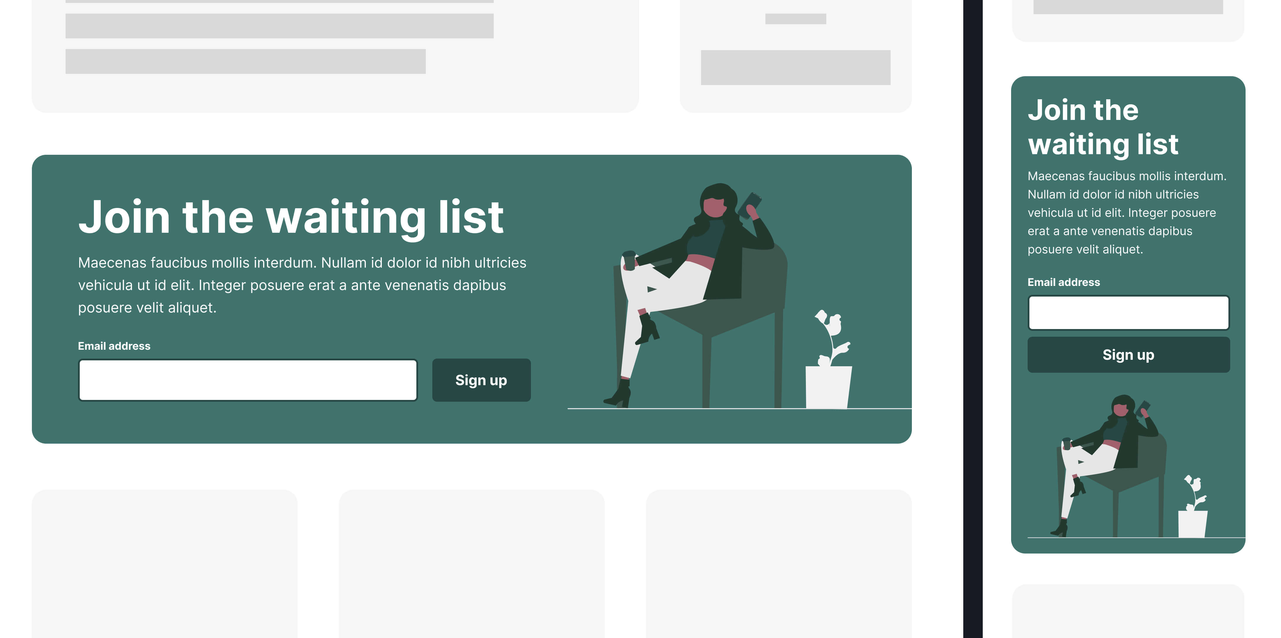
But remember, this component needed to be portable, and able to be placed anywhere on a page. So what happens if we render the component in a sidebar and view it on a large screen…

Yeah… Not ideal. This situation comes about because the fluid typography uses the vi unit. The vi/vw unit is calculated as a proportion of the viewport, not the container. So when we render the component on a large screen, but in a small area, the typography assumes there’s space to play with and explodes out of the component.
Traditionally, we’d create variants at this point, or use Javascript to handle component sizing, but we have another option available to us: CSS container queries!
They’re finally here and stable! Container queries brought along a new length unit: CQI. This unit is calculated as a proportion of the nearest named container; the element opted in with container-type: inline-size. In the same way that 1vi === 1% of the viewport, 1cqi === 1% of the container.
Using the CQI unit keeps our typography in tune with the component, rather than the whole page. Rendering the component in a column or sidebar therefore tells the typography to shrink down to a size that is appropriate for that space, even if the viewport is much wider.
This is incredibly powerful, but isn’t appropriate for every component. Typography is strongest when it’s in harmony across a page. This provides clear hierarchy for users to help them distinguish what’s important and linked on a page. If everything becomes in tune with itself, nothing is in tune. For this encapsulated component, however, it’s the perfect solution.
Applying container-driven typography
It might be tempting to hot-swap out our custom properties, but it’s always a good idea to build in graceful degradation, particularly when using shiny new CSS features. CSS has the @supports query for this very reason. It’s a way to feature detect and layer on progressive enhancement for browsers that support the feature.
Our wrapper stays as it was, with the inclusion of container-type: inline-size, then we add a @support query to see if the current browser can handle the CQI unit:
.wrapper {
    container-type: inline-size;

    --body-size: clamp(1rem, 0.9565rem + 0.2174vi, 1.125rem);
    --heading-size: clamp(1.5rem, 1.3261rem + 0.8696vi, 2rem);
    --item-spacing: clamp(0.5rem, 0.3261rem + 0.8696vi, 1rem);
}

@support (font-size: 1cqi) {
    .wrapper {
        --body-size: clamp(1rem, 0.9565rem + 0.2174cqi, 1.125rem);
        --heading-size: clamp(1.5rem, 1.3261rem + 0.8696cqi, 2rem);
        --item-spacing: clamp(0.5rem, 0.3261rem + 0.8696cqi, 1rem);
    }
}
Better!

Note: when I said earlier that the web component is totally encapsulated from the page, that wasn’t entirely true. Because a web component does not have a :root element, it calculates any internal REM values from the page :root size. This isn’t normally a problem, but if the page you place the component on has altered the html/:rootfont-size, the component will also be scaled accordingly, for better or worse.
Intrinsic layouts
Every Layout is a fantastic resource that should be in a design engineer’s arsenal. Much like Utopia, Every Layout advocates avoiding imperative media queries, and letting the content and computer decide how best to render a component. ‘The Sidebar’ is their take on the classic ‘two-column’ problem, where a secondary element gets placed below the primary content when space gets tight. But rather than anchoring to a set viewport width, we can use some clever flex magic to perform the change when the content area itself drops below a certain width.
This intrinsic approach is perfect for not only the overall component layout, but also for the input/button combination:
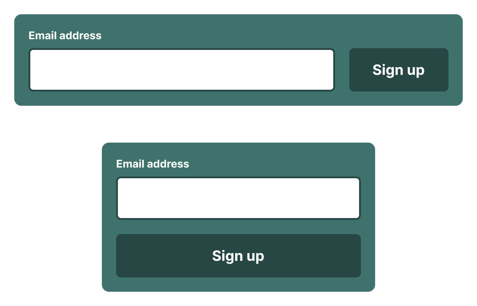
In this case, the ‘sidebar’ is the button, and the input should expand to take up as much space as is available. When the input gets thinner than our defined minimum width, the elements stack and expand to fill the space.
.form {
  display: flex;
  flex-wrap: wrap;
  gap: var(--space-2xs) var(--space-xs);
}

.form > button {
  flex-basis: 11rem;
  flex-grow: 1;
}

.form > input {
  flex-basis: 0;
  flex-grow: 999;
  min-inline-size: 60%;
}
Limitations of intrinsic design
One limitation of ‘The Sidebar’ approach is the ability to hide content when the element reaches a certain size. We may wish to hide illustrative or presentational elements on smaller screens and only show them when there is the real-estate available.
To handle this, we need to use container queries themselves. Once again, we begin with a usable baseline and layer on fidelity for browsers that support it. ‘The Sidebar’ uses display: flex, a feature that’s very well supported. And although it’s not ideal to show the illustration on smaller devices, it doesn’t look broken, and the feature still works, so this is an acceptable trade-off.
Using a @supports (container-type: inline-size) query, we can convert the wrapper from flex to grid, effectively nullifying ‘The Sidebar’ for browsers that support container queries. Then we can write a targeted container query to hide the illustration column when the component is smaller than our desired size:
.layout {
  display: flex;
  flex-wrap: wrap;
  gap: var(--space-s) var(--space-xl-2xl);
}

.illustration {
  flex-basis: 18rem;
  flex-grow: 1;
}

.primary {
  flex-basis: 0;
  flex-grow: 999;
  min-inline-size: 50%;
}

@supports (container-type: inline-size) {
    .layout {
        display: grid;
        grid-template-columns: 100%;
    }

    @container (max-width: 600px) {
        .illustration {
            display: none;
        }
    }
}

The finer details
For a couple of finishing touches, we can use the reasonably new text-wrap: balance on headings within the content. When the width of the element forces the heading text onto multiple lines, CSS will aim to ‘balance’ the text across the available space. This leads to fewer orphans hanging on the final line, improving the aesthetic quality and readability of the heading.
Finally, we can also use the ch unit to limit text width to ensure lines remain readable. This unit maps to the width of the “0” glyph in the rendered typeface, and provides a good way for us to keep line lengths under control based on the current font-size.
Posted on in Web